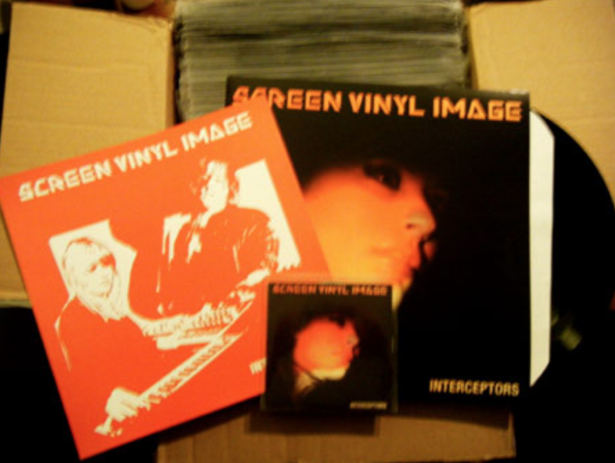
Next month is the 10 year anniversary of Interceptors, the first full length album my wife Kim and I did as our band Screen Vinyl Image. To celebrate, I wrote about the design concept we came up with.
I wanted to acknowledge two very close friends of ours who were integral to this period of our lives and who are no longer with us. I still think about Christo and Stephan quite often. They were beacons of inspiration and kindness to our community. Christo did a remix for us that I love to listen to and he also did beautiful silk screen work for us too. Stephan helped get our name out in NYC and booked us on so many amazing shows. He threw the best shows and parties and his dedication to the scene was unparalleled.
Background
By the time Interceptors came out, Screen Vinyl Image had released two short albums. Our debut EP “The Midnight Sun” and a split record with our good friends Ceremony. We were playing some shows, but still at a point where we had lots of time to record and experiment. I was still trying to learn how to mix and record better sounds. It’s been fun to listen back to these songs and remember the ah’ha moments and the things I now know how to approach better.
I had initially come up with calling the album “Phantom Interceptors,” but Kim suggested we drop the Phantom. Interceptors alone had a better sound to it, asking more questions than answering.
Like almost all of our work, there are references to films, tv, other music, art and literature in every aspect of the album. “Cathode Ray” is from David Cronenberg’s visionary film “Videodrome.” “Asteroid Exile” is inspired by the Twilight Zone episode “The Lonely.” “Chaser” is inspired by the film Vanishing Point and so on. The album’s design is no different, we pulled from a lot of the things we love.
The Logo
The early Screen Vinyl Image logo is a direct lift from the John Carpenter film “Escape from New York.” Pausing the movie, we took photos of the signage, I traced them in Illustrator, and that became the logo. This was the last album to use the logo, we continued using it on t-shirts and other swag.

Photography
The cover of Interceptors is inspired by a few ideas. We always loved the photography of The Velvet Underground. We’d borrow from them, Spacemen 3, and Sonic Youth for the SVI aesthetic often.
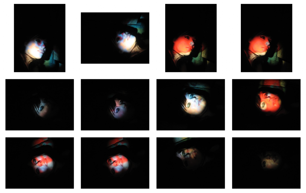
The main influence for the cover is from a film “Satan’s Sadists” starring Russ Tamblyn that is one of those biker films of the late 60’s. If I remember correctly, it was something we had on in the background late at night while we were working on mixes. There’s one particular night scene that is beautifully shot, and that is the main source of inspiration.
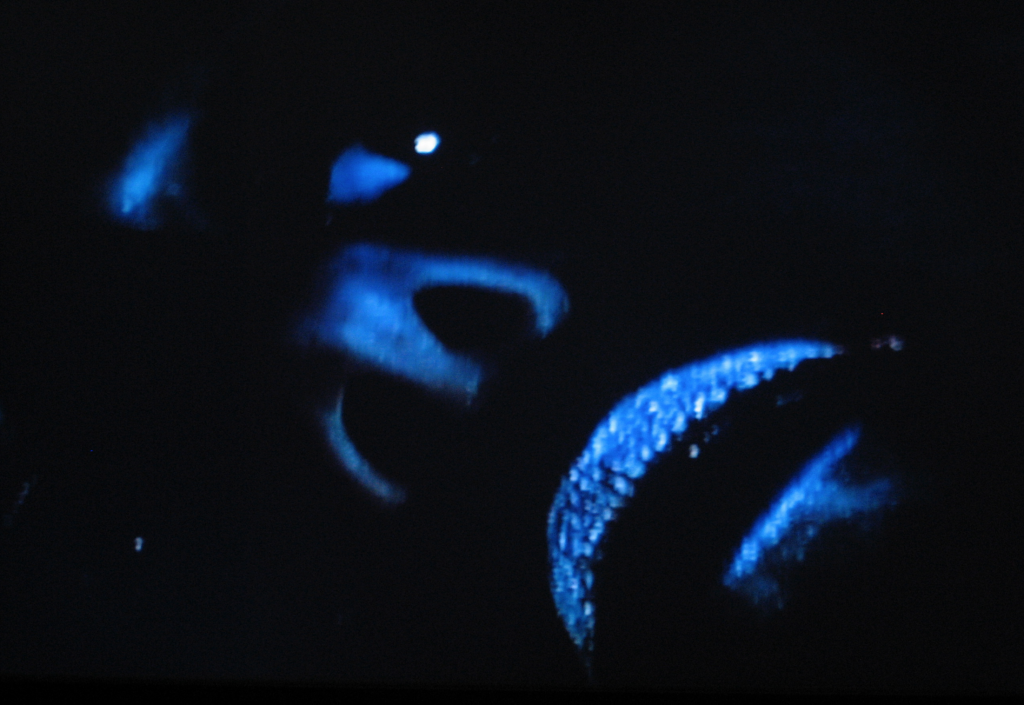
We staged the shot in our studio and used the oil projector from our live shows for lighting. Next, we set up a black bed sheet and Kim laid on it to key out the background easier. I took a piece of cardboard and cut a small hole in it so I could control the amount of oil projector light that flooded the face. We took a bunch of shots until we found something that worked with the light and color.
For the back photo, the influence was something more sinister. My favorite horror film is the original Halloween. I love everything about the style of the film and the way it’s lit. The scene where Jamie Lee Curtis is backing toward the dark doorway and Myers face slowly hits the light is one of the spookiest shots in cinema and I wanted to have that lighting effect.

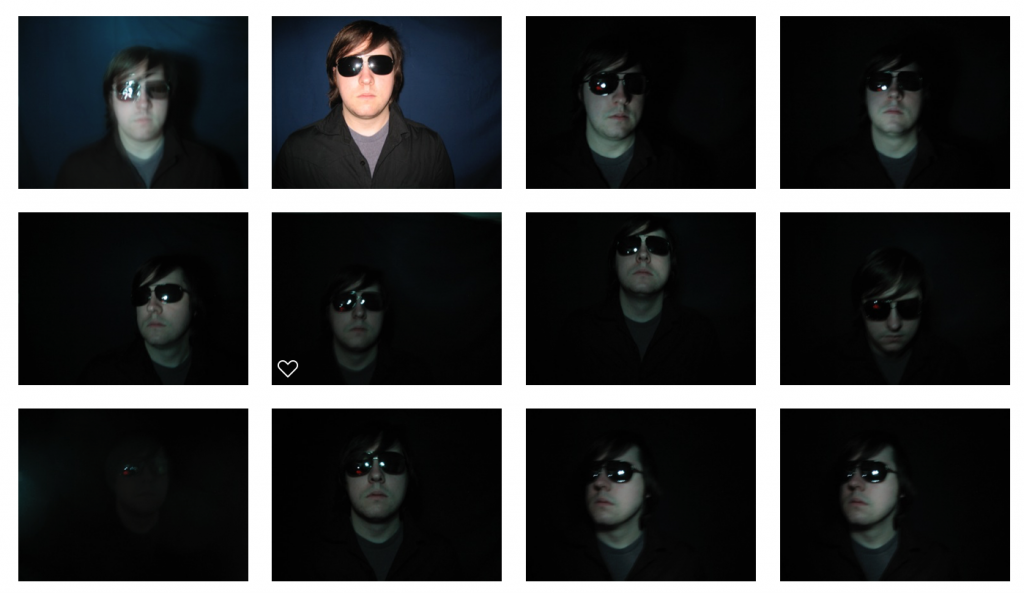
We took the initial photos and then did enhancements in Photoshop to pull the color out. For my photos, I added a deeper blue hue and lots of contrast in the lighting for a more filmic look.
I have a lot of wonderful memories of Interceptors, we were hitting a stride as a band, playing some amazing shows, and I think personally I felt like I had a design I was proud of for an aesthetic. It’s hard for me to believe it was 10 years ago, but it was fun to look back.
—
The vinyl was cut at Archer in Detroit and the jacket was printed at Imprint, additional printing was done at Furnace MFG for CDs and the first 100 came with a silkscreen insert. Interceptors is available digitally, on CD, and on vinyl.